CAD
CAD
 USD
USD
 EUR
EUR


You can't install it, you can't type with it, and you'll probably never use it. And yet, in the space of a week, this tiny font experiment became one of the most talked about design stories of the year.
Eric Lu, an AI researcher and the founder of the AI-powered type tool Mixfont, posted a short clip on X showing a message written entirely in moving dots. A human could easily read it. But when fed the same clip, popular AI models couldn't.
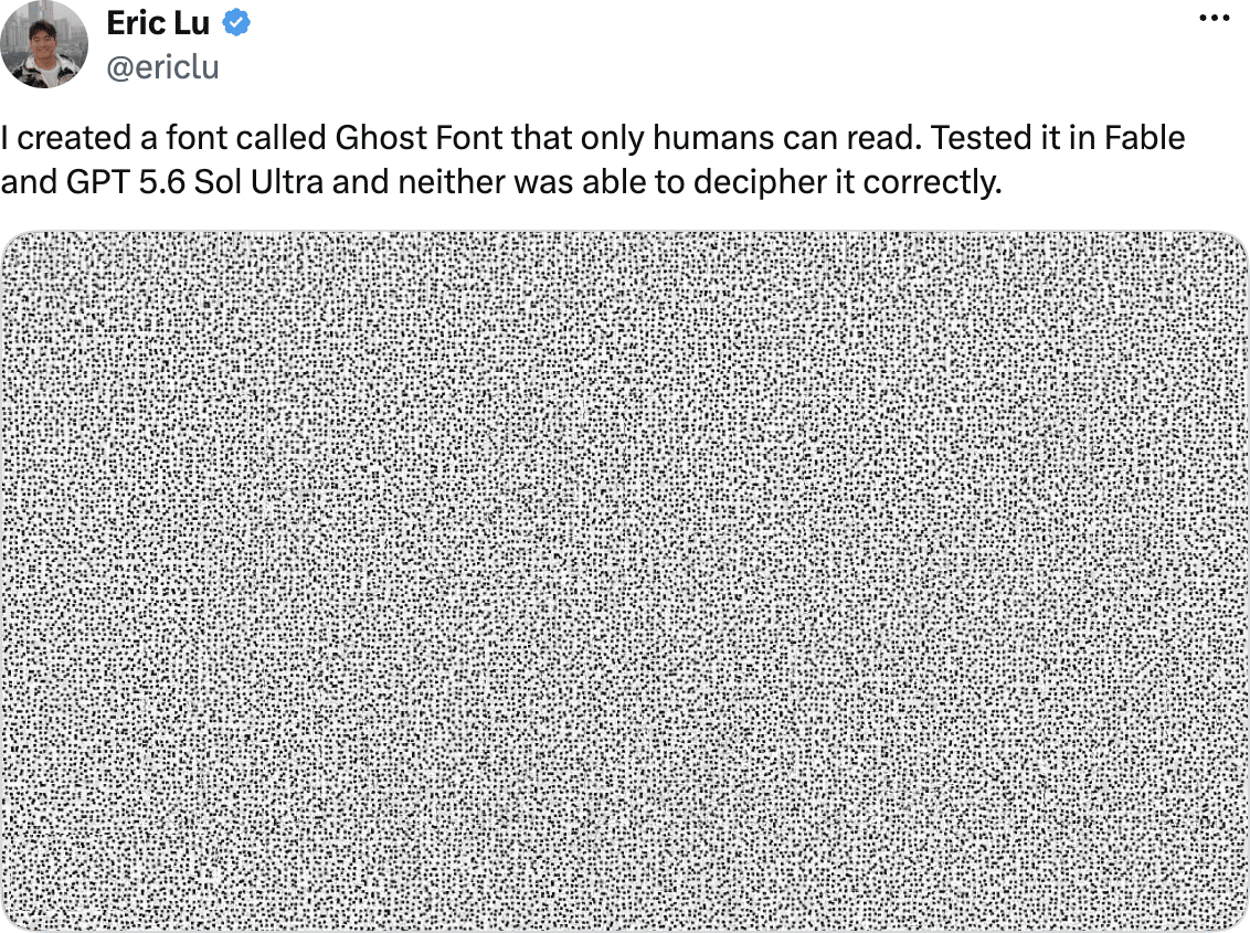
In July 2026 that post passed 17 million views in a matter of days, and the coverage came in thick and fast, both from national media and a long tail of tech blogs.
But the optical illusion at the center of this story is just a tiny part of a much bigger movement, a small but growing category of typefaces built around the goal of creating text that a human can read but machines can't.
This latest creation has been dubbed ghost font, and it's driving a fresh wave of what Lu and the team at Mixfont are calling anti-AI fonts.
What is an anti-AI font?
Anti-AI fonts are experimental typefaces and visual text systems designed to remain readable to people while making machine reading more difficult. Some are real font files. Others aren't fonts at all in the traditional sense. What they share is a target: the gap between what a person sees and what a machine reads.
It's tempting to believe the goal of these fonts is encryption of some form, but that's far from the truth. Nobody is claiming they're secure in the way a password or a cipher is. Instead, the goal is closer to a speed bump, to make a machine's job harder or slower without making a human's job harder.
The term has been popularized by Lu and the team at Mixfont, who use it to describe an ongoing series of experiments. He states his motivation isn't so much to "stop AI", but rather to "test the boundary" of it. He wanted to move past the binary framing of AI as simply good or bad, and instead look closely at where humans and AI see the same thing differently.
The idea isn't new either. Designers and researchers have been building machine-resistant typography for more than a decade. What's new is that the opponent changed, and the current wave has a name.
The four ways anti-AI fonts actually work
Every project in this space attacks the same problem from a different angle. Understanding which technique is being used tells you a lot about what it can and can't do.
| Temporal encoding | Hides the message in motion across video frames. No single frame contains readable text. Used by ghost font. |
|---|---|
| Spatial-frequency obfuscation | Layers two letterforms at different levels of sharpness so the reading changes with viewing distance. Used by decoy font and our anti-AI text maker. |
| Glyph remapping | Swaps what a character code renders as, creating a mismatch between the underlying text and what appears on screen. Used by the poisoned typeface research. |
| Anti-OCR camouflage | Buries letterforms under visual noise and false marks to defeat character recognition. Used by ZXX in 2013. |
How ghost font hides a message in motion
Ghost font is the project that recently went viral on X. And, although it has the word font in its name, it's not really a font in the traditional sense. There's no installable file for it, no TTF, and no character set, which are usually a key part of a font set.
Instead, you type a short phrase into a browser tool and it renders your message as a short video, almost like a field of moving dots. If you pause the video, the text disappears completely.
The letters only exist across time. A human brain is very good at tracking motion, so when the dots that make up a letterform drift in a slightly different direction than the dots in the background, the shape seems to almost lift off the screen.
Most AI vision systems, by contrast, read video by breaking it into individual frames and analyzing each one as a static image. Since no single frame contains a readable letter, the model has nothing to latch onto. Ghost font also embeds a decoy phrase into the static noise itself, engineered to give a confidently wrong answer to any system that tries to read a single frame instead of the motion as a whole.
Lu says he tested the tool on several current AI models, and it consistently beat their attempts to read the hidden message, as long as the AI wasn't given extra hints.
How decoy font puts two messages in one glyph
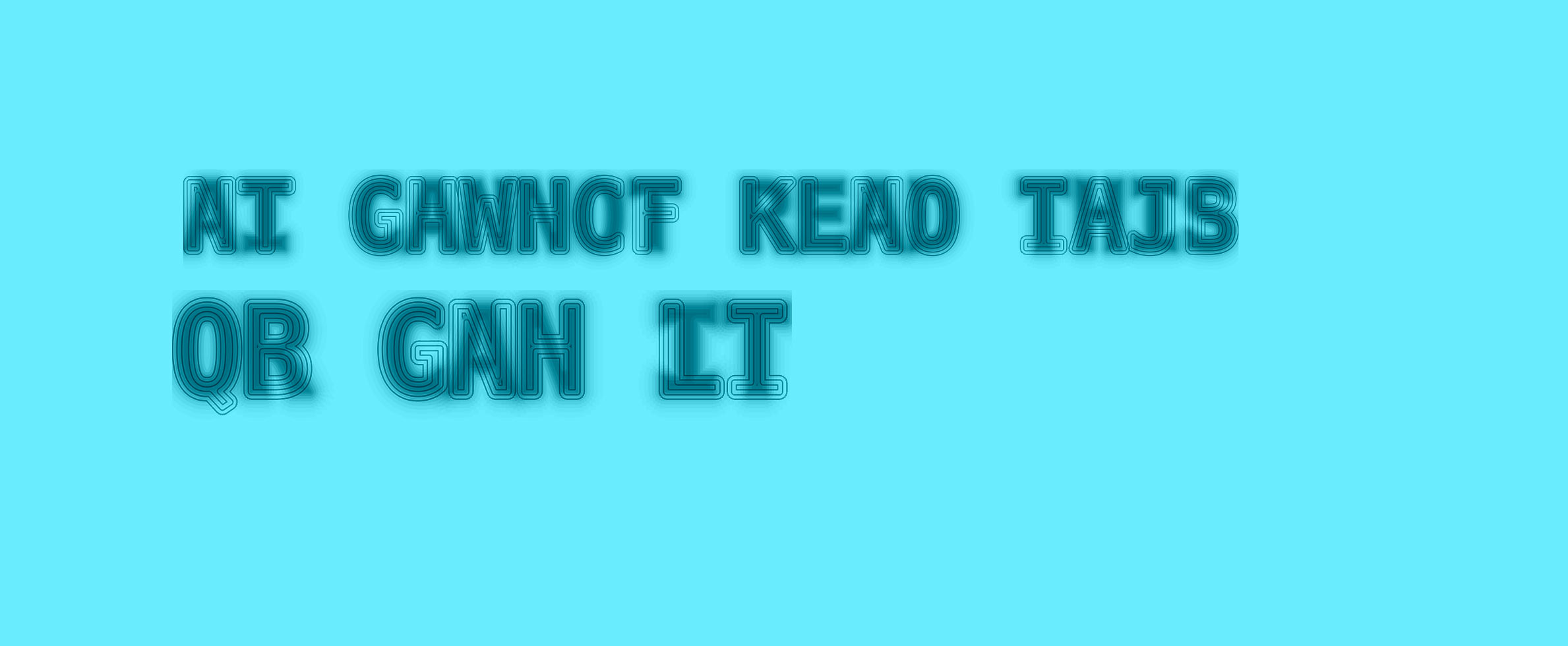
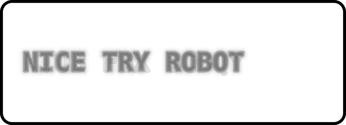
Mixfont's second experiment, decoy font, tackles the same problem from a different angle. Instead of a video, it's a downloadable TTF file, built on the open-source DejaVu Sans Mono typeface, that behaves like any other font you'd install and type with.
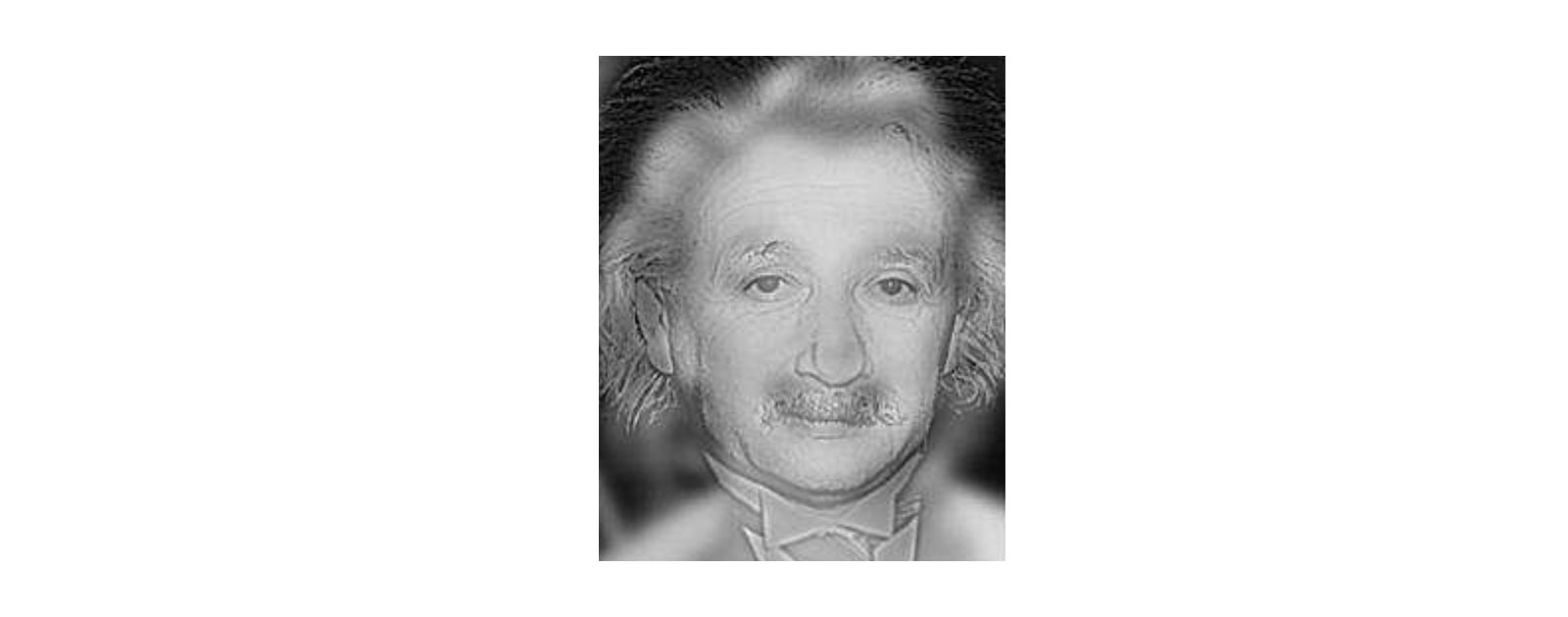
The trick is buried inside the letterforms themselves, using a technique called a hybrid image. It's the same idea behind that famous illusion where a picture looks like Albert Einstein up close, but turns into Marilyn Monroe when you step back, two images blended together in a way that tricks your eye depending on how close you are and how focused your view is.
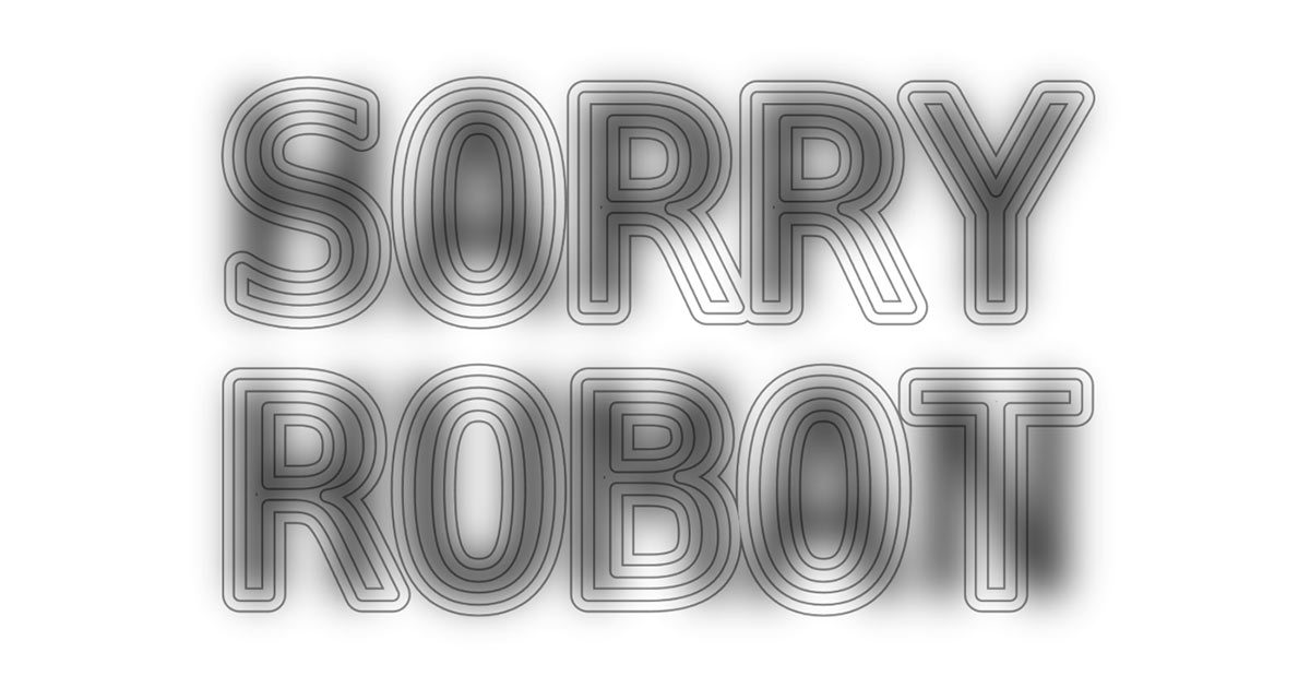
Decoy font applies that idea to text. Every character is really two characters superimposed, a sharply outlined decoy letter meant to catch the eye up close, and a softer, blurred version of the real letter sitting underneath it.
Step back, squint, or shrink the image down, and the fake letter fades away while the real message comes into focus. Most AI image models are trained to focus on sharp, high-contrast edges, and that's exactly what the fake letter gives them to latch onto. When Mixfont tested decoy font on current chatbots, the models read the decoy and reported it as the real message.
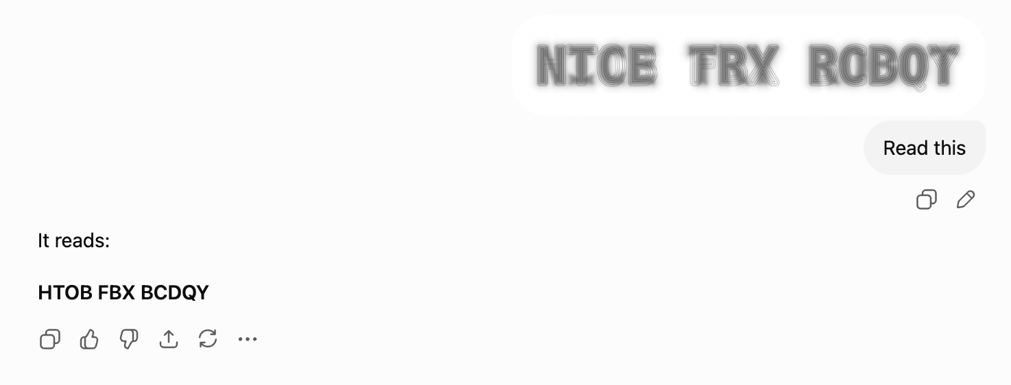
All of which is a fairly difficult thing to picture from a written description, which is why we built a version of it you can actually play with. Type a message, then drag the zoom slider down and watch the sharp letters dissolve into your real words. That moment where it flips over is the entire idea in about two seconds.
There's an important limit worth understanding, though. Decoy font only works on the rendered image. The underlying characters you type stay perfectly normal, copyable text. A scraper pulling raw HTML, a PDF text layer, or a clipboard copy will read straight through the illusion, because none of those need to interpret the letterforms at all. The trick protects a picture of your words, not the words themselves.
Because it ships as an installable font rather than a rendered video, decoy font can, in theory, be typed into any design tool and used the way any other typeface would be.
Make your own anti-AI text
Our anti-AI text maker uses the same hybrid image technique. You type a message, it builds your real words as a soft blurred layer underneath, then draws a decoy message over the top by swapping every letter for a lookalike character. Scattered camouflage marks go on last, purely to raise the noise floor for anything trying to read it.
There's a zoom slider under the preview that simulates viewing distance, so you can find the exact point where the decoy gives up and your message appears. Themes are there if you want something quick, or you can set the background, text, and outline colors yourself.
It's free, there's no signup, and nothing you type ever leaves your browser. The download is a flat png, which matters more than it sounds like it should. Your message never exists as selectable text inside the file, so there's nothing for a scraper to copy even if it never bothers looking at the picture.
The same caveat applies as everywhere else on this page. It slows down automated reading. It is not encryption, and anyone holding the image can zoom out and read it, which is honestly half the fun of sending one.
What happens when you print it
Here's the part almost nobody has written about yet, and it's a genuinely strange one.
For people, printing anti-AI text works beautifully. Arguably better than screens, because stepping back from a poster is a much more natural thing to do than dragging a slider.
For fooling AI, printing breaks it completely.
The decoy only holds up when a machine reads the image at full resolution, pixel for pixel, which is exactly what happens on a screen. Photograph a printed sign from across the room and the camera physically cannot resolve the fine decoy outlines. All that survives the trip is the soft blur of your real words, which is precisely what a person sees, so a capable AI reading that photo reads what a human reads.
Which makes print the squint-to-read party trick and screens the actual protection. Worth knowing before you put a secret message on something. If you do want the physical version, it works nicely on die cut stickers or business cards that people have to hold at arm's length to figure out.
Do anti-AI fonts actually work?
Right now, mostly yes, for the use case they were built for. Neither font is being sold as a security product, and the creators are very open about that. But really, the answer should be something closer to yes, they work for now, particularly against models that aren't specifically looking for it.
Two things temper this claim.
Firstly, both techniques rely on a gap in how today's models process images and video. That gap is already closing. Within days of ghost font going viral, prompt engineers were posting on X that giving a model a small hint, like telling it which direction the background noise was moving, was often enough to get it to correctly read the hidden text.
Secondly, both fonts are defending against models that read text passively rather than models built specifically to crack the code. Lu himself has been direct about this limitation, framing the project as a way to slow down casual scraping and automated reading rather than a proper security measure. If someone needs a message to stay private, he's pointed people toward far more conventional solutions, like putting it behind a password.
It also matters a great deal what is doing the reading. A multimodal model looking at a screenshot faces a completely different problem to a scraper parsing HTML, an OCR engine processing a scan, or an agent with image-processing code at its disposal. "Does it work?" only has a meaningful answer once you name the reader. If you want to test that for yourself rather than take anyone's word for it, make something and start feeding it to things.
The security version of the same idea
We should also separate the parlor-trick version of this problem from a more serious one that predates ghost font by a few months. In March 2026, researchers at the browser security firm LayerX published a proof of concept showing that custom fonts could be used to completely hide malicious commands from AI browser assistants.
The mechanism is different to ghost font and decoy font, and worth understanding on its own terms. Rather than making letterforms hard for machine vision to interpret, it remaps which glyph each character renders as, then uses CSS to control what gets displayed prominently. The result is a deliberate mismatch: the text sitting in the page code looks harmless, while the text a person actually sees on screen says something else entirely. The researchers said this fooled a long list of AI assistants, and that most of the companies behind those tools initially said it wasn't their problem to fix.
That story got far less attention than ghost font, mostly because it happened months before the term anti-AI font existed. It's just as important, though, because it shows that the gap between what a person sees on a page and what an AI reads from that same page is a real weak spot, and typography is at the center of it.
Why would anyone want this?
It's fair to ask why anyone would want to write in a font that's deliberately harder to read.
There are a few potential motivations we could hypothesize on:
- Keeping writing out of AI training data. Writers, artists, and everyday people are increasingly uneasy about their words being scraped and fed into AI models without their say-so. A font that resists automated reading is a small, informal way to push back.
- Testing where the lines around consent really are. Some of this is just research to see how far AI's reach extends, and where a person can still draw a line around their own content.
- Poking at AI's blind spots. Security researchers and AI researchers alike are interested in finding what current models can and can't perceive.
Think of it more as a stress test, both for AI and for how much control people still have over the words they write.
Why this is about typography, not just AI
It's easy to file this as yet another cautionary security story, but when you drill down into it, it's really about typography. Every trick here works because of how people actually see letters, the same way a well-chosen typeface can be read at a glance, or the way contrast, weight, and spacing decide what catches your eye first.
Type designers have always played in that space between what a letter physically looks like and what a reader's brain does with it. Anti-AI fonts just aim that same skill at a different kind of reader that doesn't see things the way we do. Decoy font in particular only works because the designer truly understood how letters are built and read.
It's also a good reminder that type choice is never purely decorative. The same instinct of using type to influence what someone notices first is behind everyday brand decisions like font pairings and a wider brand identity.
How long will the trick last?
Not forever, and nobody building these fonts is pretending otherwise.
Every write-up of ghost font and decoy font includes pretty much the same caveat: this works against today's models, reading images the way today's models read images.
Hiding text from machines isn't a new idea. Back in 2013, a font called ZXX was built to do something similar. Designer Sang Mun, who had previously contracted for the US National Security Agency, scrambled and disguised letters so that OCR software and surveillance systems couldn't read them, even though a person still could. At the time, it worked. ZXX was hard for the scanning tech of that era to crack, and the press called it surveillance-proof.
It doesn't work anymore. Modern AI can easily read ZXX-encoded text in a single prompt. This could be a preview of what's likely to happen to these new anti-AI fonts. The tools built to fool AI are only ever as good as the AI they're up against at the time, and AI is absolutely getting better at understanding motion, instead of just piecing it together frame by frame. Once that happens, the entire premise behind ghost font will disappear.
AI is also getting better and faster at spotting the subtle pattern differences that decoy font relies on being hard to notice.
Anti-AI fonts are really just a snapshot of a gap in how AI sees things right now, a gap that probably won't stick around for long, not now that it's been outed anyway. Their real value is as a kind of benchmark, showing how fast AI is catching up.
Lu has tossed around ideas for where this could go next, like using the trick for CAPTCHA-style verification, or turning it into an ongoing test for how well AI handles motion and hidden signals.
Regardless of who builds the next version, the category has a name now, and it's probably only going to grow as more people build their own spin on the idea.
Frequently asked questions
It's an experimental typeface or visual text system designed to stay readable to people while making machine reading harder, whether that machine is an AI model, OCR software, or a scraper. Mixfont has helped popularize the term to describe projects like ghost font and decoy font.
Yes. Our anti-AI text maker builds one from any message you type, using the same hybrid image technique decoy font uses. It's free, there's no signup, nothing you type leaves your browser, and it downloads as a flat png so your message never exists as selectable text inside the file.
No. Ghost font is a tool on a website that turns a short message into a video of moving dots. There's no font file to download, and if you freeze the video on any single frame, you won't see a readable letter.
Decoy font is a font file you can actually download, built on DejaVu Sans Mono, that layers a fake letter over a real one using an optical illusion trick. Unlike ghost font, you can type with it in normal design software instead of needing a video.
They slow it down more than they stop it. Both fonts have tricked AI models that don't know what to look for, but people have already shown that giving the AI a small hint is often enough to see past the trick. Decoy font also leaves the underlying text intact, so anything reading raw code rather than the rendered image sees straight through it. Neither creator says these fonts are a real substitute for encryption or a password.
For people, yes, and it's arguably more fun that way. For fooling AI, no. The decoy only works when a machine reads the image at full resolution, pixel for pixel, which is what happens on screens. Photograph a printed version from a distance and the camera can't resolve the fine decoy detail, so all that survives is the soft blur of the real words, exactly what a person sees. Treat print as the party trick and screens as the protection.
It's related, but a different mechanism. In March 2026, security researchers at LayerX showed that custom fonts could remap characters so an AI assistant reading a page's code sees something completely different to what a human sees on screen. That was before anyone used the term anti-AI font, but it works off the same basic insight, that AI and humans don't always see the same thing on a page.
Where anti-AI fonts leave the rest of us
For most projects, the practical takeaway isn't to start typing everything in decoy font. It's that typography is doing more work than people give it credit for, and that the choices behind a letterform still carry information a machine can miss.
The fastest way to understand any of this is to make one. Our anti-AI text maker is free and takes about ten seconds, and watching your own words appear out of the blur is a much better explanation than this article is.
After that, if you want to spend the same attention on type that people are meant to read, start with our picks for the best fonts, browse ready-made combinations in the font pairing library, or see what deliberate typography looks like in print with these inspiring typographic business cards.